#FAF4E6
Cream
--cream Primary background
The default ground for nearly every surface. Warm parchment, never pure white.
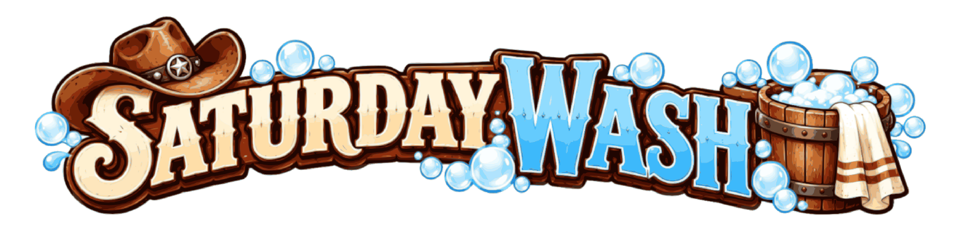
Saturday Wash LLC · Visual Identity
Direction Ranch Hand (2a). Hand-painted signboard energy on warm parchment. Oxblood leads, soap-bubble blue and brass accent, and body copy is always ink on cream.
01 — Logo
One primary lockup, used whole. The cowboy hat, the soap bubbles, and the wash bucket are not decoration around the wordmark — they are the wordmark.
Reserve a margin equal to 25% of the lockup's height on all four sides. Nothing crosses it: no type, no rules, no photo edges. The dashed band shows the minimum.
160px wide on screen. 1.25in wide in print.
Do
Don't
02 — Color
Cream ground, Oxblood lead, Bubble Blue and Brass as accents only. Long copy is always Ink on Cream — never accent on accent.
--cream Primary background
The default ground for nearly every surface. Warm parchment, never pure white.
--oxblood Primary brand color
Display type, heavy borders, badges, primary buttons. The color people should remember.
--bubble-blue Secondary accent
Soap-bubble blue pulled from the logo. Fills, rules, and large graphics only.
--brass Tertiary accent
Small ornaments, ticks, and eyebrow type on dark grounds.
--ink Body text
All running copy. A dark warm brown — never pure black.
Derived for the website. Brass and Bubble Blue are gorgeous and illegible as small text on Cream; these are the stand-ins that keep the same feel and clear WCAG AA.
--brass-deep Text-safe brass
Eyebrows and small type on cream, where plain Brass fails contrast.
--blue-deep Text-safe blue
Links, captions, and focus rings on cream.
--oxblood-bright Interactive state
Link and button hover, per the handoff.
--sand Hairline rules
Dividers and light card borders. The specimen border color.
--cream-deep Alternating surface
Banding one section against the next without leaving the parchment family.
--ink-soft Secondary text
Captions and metadata on cream. Fine for supporting copy, not for long reads.
Target mix for a page: mostly parchment, a confident amount of Oxblood, Ink for the reading, and accents measured in teaspoons.
03 — Contrast
Computed live against WCAG AA for normal text (4.5:1). Anything marked Large only is fine at 24px+ or bold 19px+; anything failing outright is for fills and ornaments, never letterforms.
| Color | on Cream | on Ink |
|---|---|---|
| Cream | 1.00:1 Fill only | 13.52:1 AA |
| Oxblood | 6.81:1 AA | 1.99:1 Fill only |
| Bubble Blue | 2.40:1 Fill only | 5.64:1 AA |
| Brass | 2.54:1 Fill only | 5.32:1 AA |
| Ink | 13.52:1 AA | 1.00:1 Fill only |
| Brass Deep | 4.86:1 AA | 2.78:1 Fill only |
| Blue Deep | 5.08:1 AA | 2.66:1 Fill only |
| Oxblood Bright | 5.03:1 AA | 2.69:1 Fill only |
| Sand | 1.49:1 Fill only | 9.06:1 AA |
| Cream Deep | 1.12:1 Fill only | 12.06:1 AA |
| Ink Soft | 6.15:1 AA | 2.20:1 Fill only |
Brass and Bubble Blue flip sides. On Cream they are decoration. On Ink they are legible text — which is exactly why the footer and the TikTok band set their eyebrows in Brass and their metadata in Bubble Blue.
04 — Typography
Display / Brand
Ranchers
ABCDEFGHIJKLM
NOPQRSTUVWXYZ
abcdefghijklmnopqrstuvwxyz
0123456789
Weight 400, the only weight. Hand-painted signboard bounce that matches the logo. Line height 0.95–1.05, never looser. Headlines, product names, and nothing else — Ranchers is not a UI font and never sets a paragraph.
Body / UI
Inter
ABCDEFGHIJKLM
NOPQRSTUVWXYZ
abcdefghijklmnopqrstuvwxyz
0123456789
Weights 400 and 600 only. All running copy, directions, navigation, buttons, and captions. Line height 1.65 for body, measure capped at 62 characters.
| Step | Token | Face | Size | Used for |
|---|---|---|---|---|
| Display XL | --display-xl | Ranchers | 44 → 80px | Page hero only, once per page |
| Display LG | --display-lg | Ranchers | 34 → 54px | Section headings |
| Display MD | --display-md | Ranchers | 26 → 36px | Card and product names |
| Display SM | --display-sm | Ranchers | 22px | Sub-headings, label mocks |
| Eyebrow | --eyebrow-size | Inter 600 | 11px / 3px tracking | Kickers above headings |
| Body LG | --text-lg | Inter 400 | 18px | Lede paragraphs |
| Body | --text-base | Inter 400 | 16px | All running copy |
| Small | --text-sm | Inter 400 | 14px | Captions, descriptors, footer |
Eyebrow · Inter 600 · 11px · 3px tracking
Lede paragraph, Inter 400 at 18px. One per section, used to carry the idea the headline only gestures at.
Body copy, Inter 400 at 16px on a 1.65 line height. Ink on Cream, measure held to 62 characters so the eye never loses the line on a wide screen.
Caption / descriptor, Inter 400 at 14px in Ink Soft.
05 — Components
Square corners (2px radius at most), 2px borders, uppercase Inter 600 with 1.5px tracking. These are painted signs, not app chrome.
The bottle-label stack from the handoff, reused on the site so packaging and web read as one thing: eyebrow, product name, descriptor, centered inside a 3px border.
Saturday Wash LLC
Saturday Clean
All-purpose scrub · 32 fl oz
Saturday Wash LLC
Saturday Shine
Old-fashioned polish · 32 fl oz
Saturday Wash LLC
Saturday Glass
Streak-free shine · 32 fl oz
A label states the one size in that bottle. The website states all three — see Sizes below.
Every product ships in the same three sizes, so the row is identical on all three product pages and takes the product's accent as its border.
Available in — Clean
Available in — Shine
Available in — Glass
On cards the compact variant drops the chips to one Ink Soft line, where the sizes are supporting detail rather than the decision.
Brass tick — opens a section above the eyebrow.
Sand hairline — separates rows and cards.
Oxblood 3px — frames labels and hero art.
06 — Product System
Each product borrows a color already in the palette instead of introducing its own. The lineup stays recognizable as one family on a shelf and in a 9:16 frame.
Oxblood
Cuts trail dust
The workhorse of the outfit. Counters, sinks, stovetops, tailgates — anywhere the week left a mark.
All-purpose scrub · 32 fl oz · 64 fl oz · 1 gallon
Brass
Brings the gleam back
A slow polish for things worth keeping. Chrome, boots, brass, and the old car your granddad bought.
Old-fashioned polish · 32 fl oz · 64 fl oz · 1 gallon
Bubble Blue
Leaves nothing but the view
Windows, windshields, and mirrors. No haze, no rainbow streaks, no second pass with a dry rag.
Streak-free shine · 32 fl oz · 64 fl oz · 1 gallon
The accent colors the label border, the section rule, and the product page hero — never the body text, which stays Ink throughout.
07 — Illustration
The brand's imagery is hand-painted western illustration: red rock, warm dust, big skies, working people mid-task. It is intentionally detailed, which means it gets framed rather than overlaid.
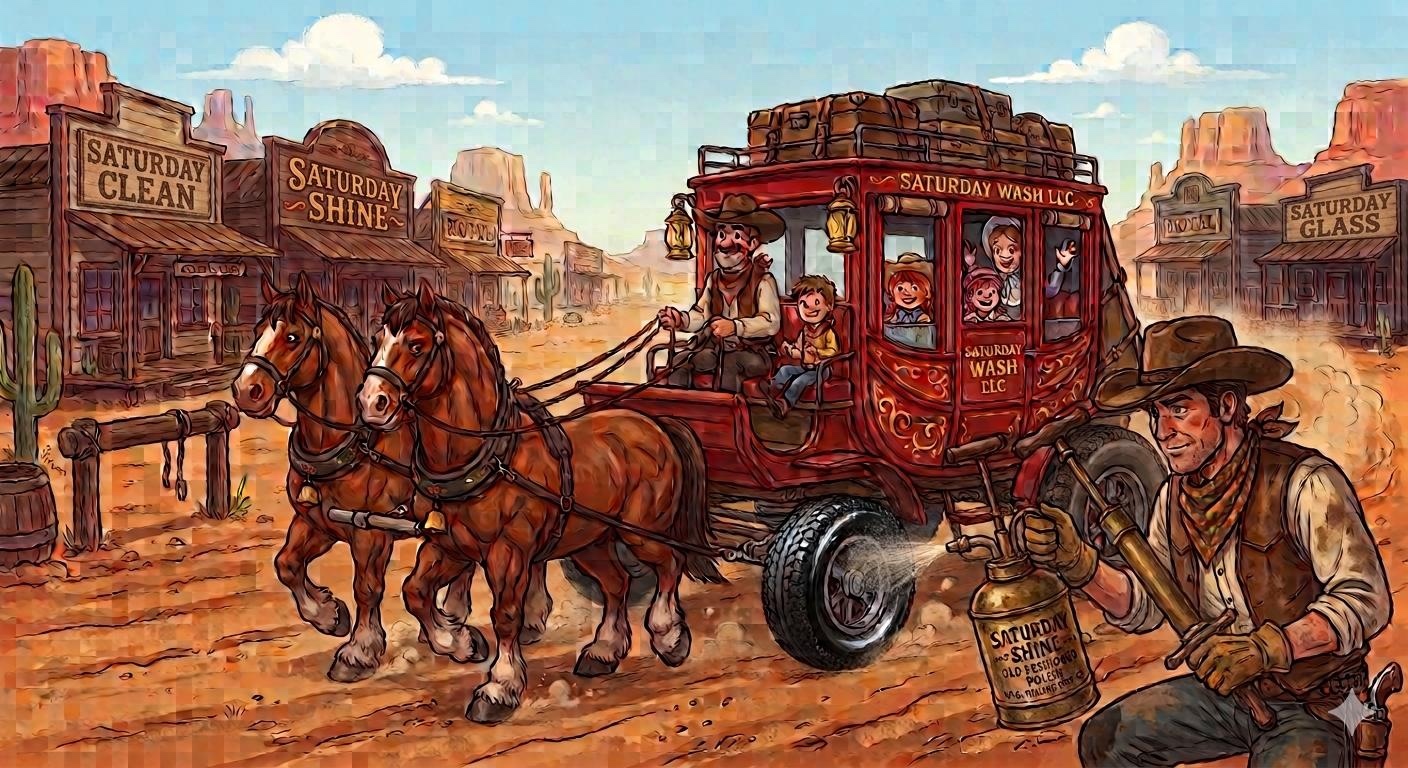
The stagecoach scene exists only at 1408×768. That is too small to run full width — a 1300px slot on a retina screen wants roughly 2600 real pixels, and upscaling a painted image to fill it just looks soft. Any illustration meant to run as a hero should be delivered at 3000px wide or more. Until then, illustration is used at 820px and under.
Do
Don't
08 — Photography
The product photography is bright, clean, and daylit — a deliberate contrast with the painted illustration. Each product is shot the same five ways so the lineup stays a family.
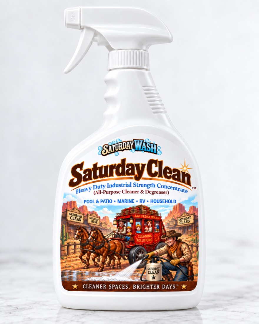
4:5 · identical across all three
Product page hero and homepage lineup. The bottle on a white ground, shot the same way every time.
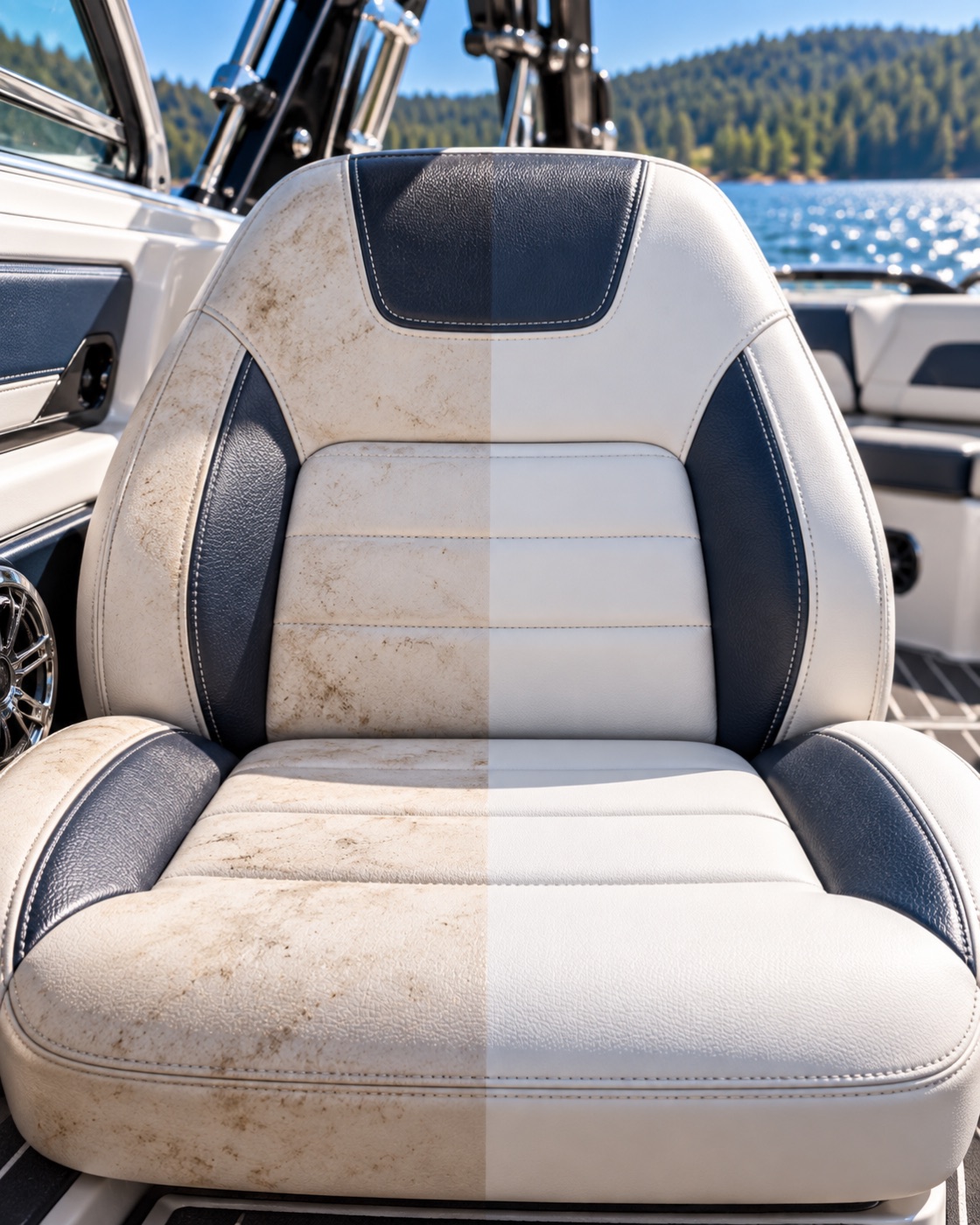
4:5 · vertical split
The proof band. One surface, split down the middle, with Before and After labelled under it.
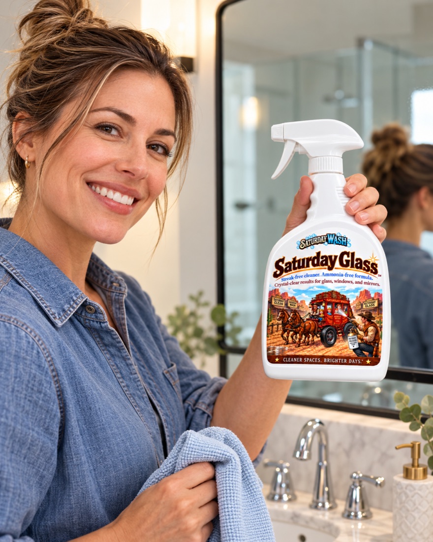
2:3 or 4:5
A person using the product where it belongs. Carries the social rail and the product page.
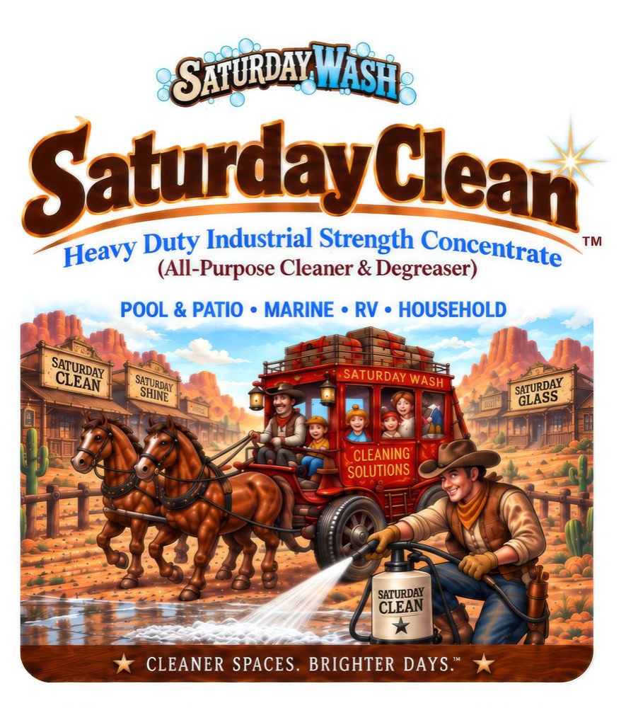
~6:7
Reference only. The source of truth for product copy — never the hero.
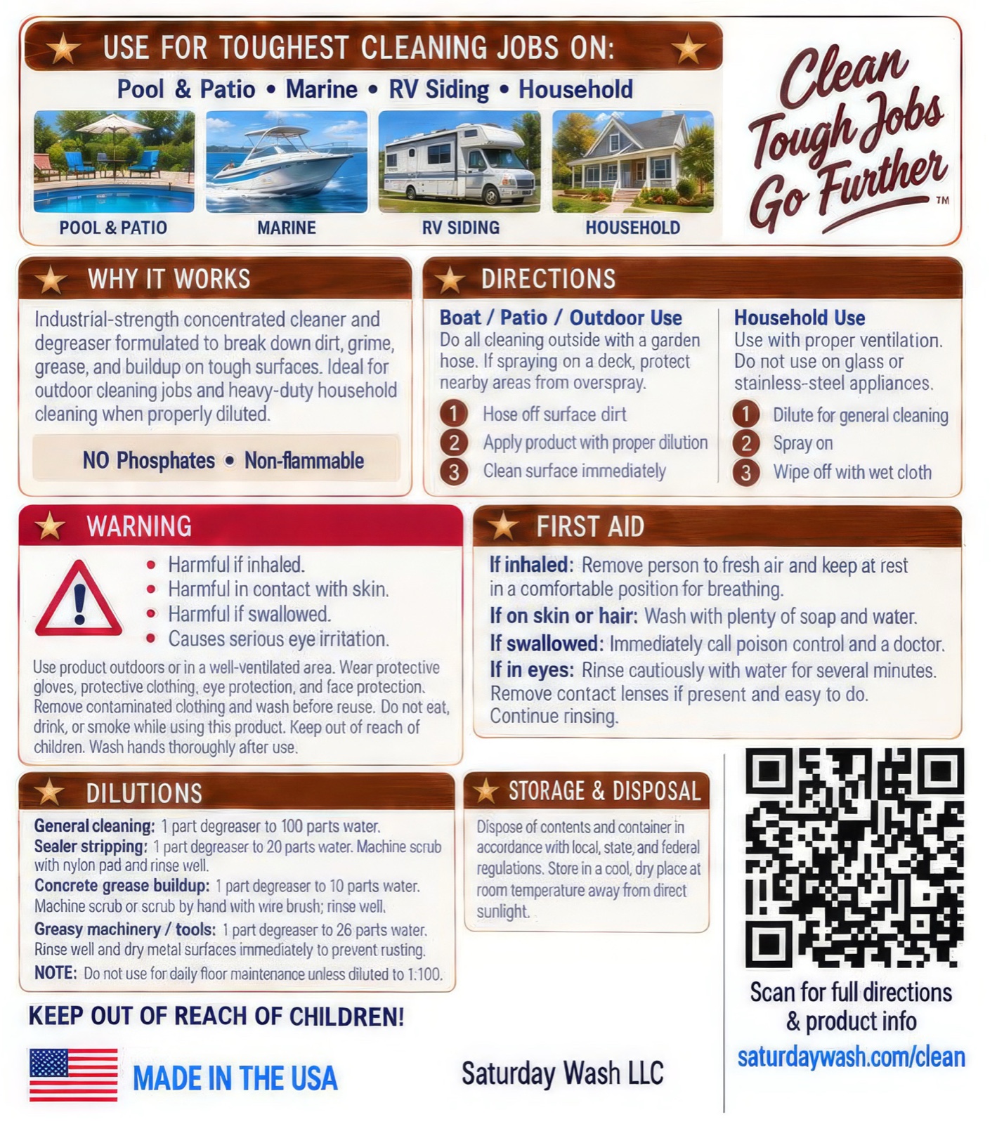
~6:7
Reference behind a disclosure. Its directions and safety copy are set as real text on the page.
Illustration gets the heavy 10px Oxblood frame with a Sand outline, like a saloon painting. Photography gets a single Sand hairline and nothing else. Putting the heavy frame on a photo makes it read as a historical artifact instead of a product you can buy today.
Do
Don't
09 — Voice
Western flavor lives in the rhythm and the nouns, not in the spelling. We never drop a g to sound folksy.
YesCuts trail dust and week-old grease. One pass, no second rag.
NoYeehaw! This here varmint of a cleaner sure does rustle up them dirty critters!
YesStreak-free on glass, mirrors, and windshields.
NoThe most powerful cleaning breakthrough in a century.
YesSpray it. Let it sit a minute. Wipe.
NoApply the solution liberally and allow adequate dwell time prior to agitation.
10 — TikTok
The brand in a vertical frame
TikTok is the primary channel, so the identity has to survive a 1080×1920 frame watched on a phone with the sound off.
Saturday Wash
One pass.
No second rag.
9:16 safe area — 12% top, 22% bottom.
On-screen type
Color in video
Structure